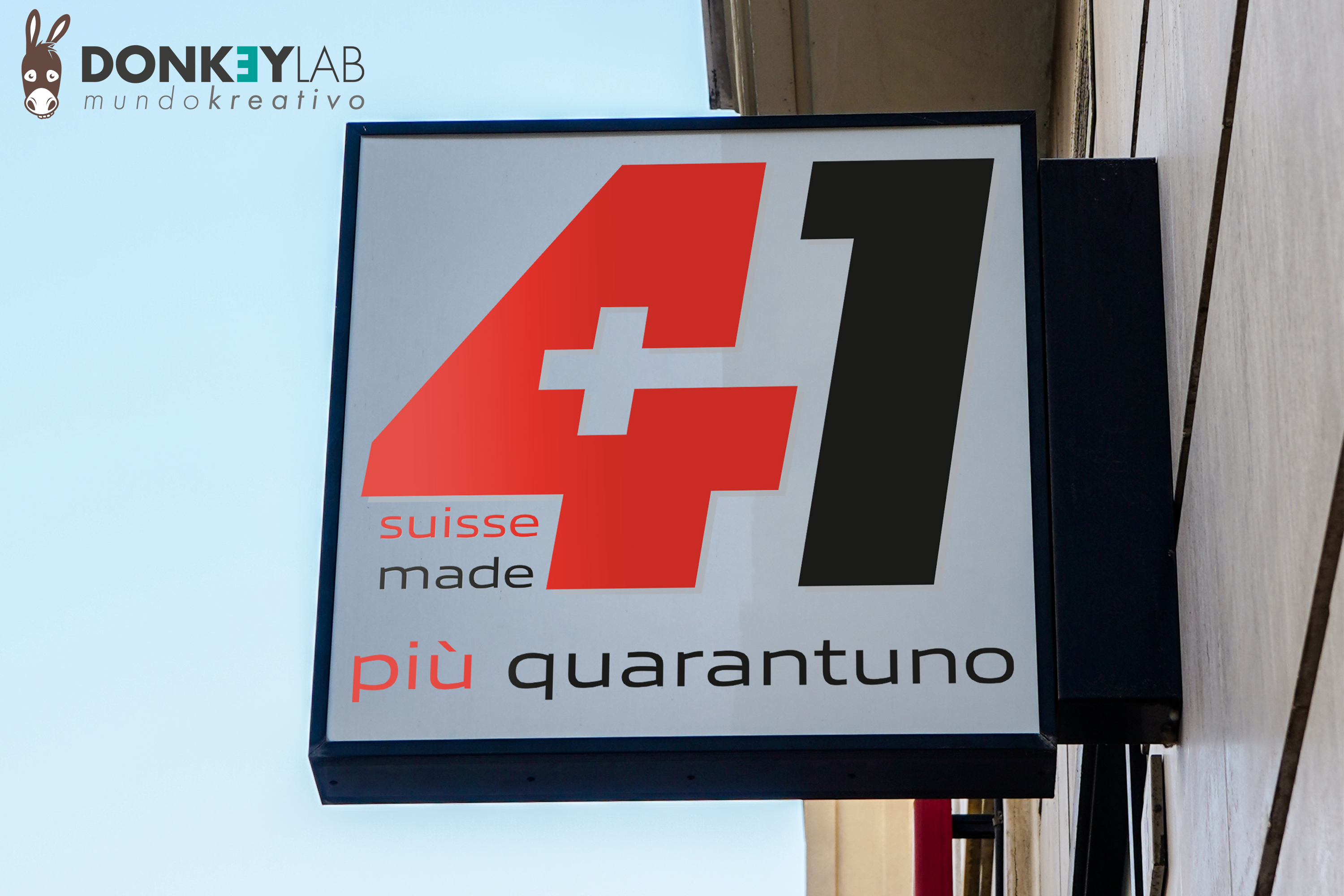
+41 Backlit Sign: LED Signage for a Swiss Publisher
A sign is the most permanent piece of advertising a company has. It stays on the building every day, all year, seen by everyone who passes. For +41, a publishing company in Switzerland, we designed and realised a backlit sign that had to do more than show a name: it had to express the brand’s identity and stand out on the street, day and night.
The brief: more than a name on a wall
The client wanted a sign that would identify the company, reflect its standing and become a point of reference in the urban landscape. The name itself, +41, is the international dialling code for Switzerland, so the brand is deeply tied to its country. The sign had to make that connection visible.
The design
Red and the Swiss cross
The sign uses a bold red and the Swiss cross. Together they communicate the brand’s origin at a glance, along with values people associate with Switzerland: reliability, precision and quality.
Typography
The typeface chosen for “più quarantuno”, the Italian reading of the name, is modern and timeless at the same time. On a sign, typography has to be readable from a distance and at different angles, so we chose clean letterforms with strong proportions.
Close collaboration
We worked closely with the client at every step, from the first sketches to the choice of colours and materials. Every detail was checked before production, because a sign, unlike a web page, cannot be changed with a click.
The backlighting
Lighting was one of the key points of the project. A backlit sign has to be bright enough to stand out at night, but not so intense that it becomes harsh or makes the design hard to read. The light should enhance the sign, not overpower it.
We used low-energy, long-life LEDs. They have clear advantages:
- low running costs, because they use little electricity;
- long life, so maintenance is rare;
- even light across the surface of the sign;
- lower environmental impact than traditional lighting.
Why a backlit sign
An unlit sign disappears after sunset. A backlit sign keeps working in the evening, in winter when days are short, and in bad weather. For a business on a street with people passing at all hours, it doubles the time the sign is visible.
A well-made illuminated sign also communicates quality. It tells people that the company is established and takes care of its image.
From design to installation
A sign project follows these main steps:
- Survey: measuring the facade and checking the position, visibility and power supply.
- Design: layout, colours, typography and simulations on photos of the building.
- Technical specifications: materials, lighting, dimensions and fixing system.
- Permits: checking local rules on signs and illumination.
- Production and installation with specialised partners.
Our background in construction and surveying helps here: we read the facade like a technical drawing, not just as a background for a logo.
A landmark for the brand
The finished sign works as both advertising and design. It guides clients and visitors to the office, it is recognisable from a distance, and it shows the brand’s identity every day. It is a clear example of how good design and careful execution can turn a functional object into part of a company’s image.
Signage at Donkey Lab
We design signs, office signage, window graphics and large-format prints, as part of a complete brand identity. We have worked with clients in Switzerland, Italy and Spain.
Materials and durability
An outdoor sign must face sun, rain, wind and cold for years. The choice of materials is therefore as important as the design:
- Aluminium boxes and frames resist corrosion and stay light.
- Opal acrylic faces spread the LED light evenly and avoid visible hot spots.
- UV-resistant vinyls and inks keep the red from fading in the sun.
- Sealed electrical components protect the lighting from moisture.
Good materials cost a little more at the start, but they keep the sign looking new for much longer and reduce maintenance.
Signs as part of the brand
A sign should never be designed in isolation. Its colours, typography and symbols must match the logo, the stationery, the website and the vehicles, so that a client recognises the company in every place they meet it. The +41 sign works because it uses the same strong elements as the rest of the identity.
Frequently asked questions
Are LED signs expensive to run?
No. Low-energy LEDs use little electricity and last a long time, so running and maintenance costs are low.
Do I need a permit for an illuminated sign?
Often yes. Rules depend on the town, so they must be checked before production.
Can you show how the sign will look on my building?
Yes. We prepare simulations on photos of your facade before production.
Do you handle production and installation?
We design the sign and coordinate production and installation with specialised partners.
Want a sign that gets noticed?
See more signage and identity work in our portfolio.