Author Archive

Home / Author's Article(s) / Eros Belotti

In Los Realejos, on the green north coast of Tenerife, we worked on the design of a student residence with 24 rooms and shared labs. Our job was to take the project from the first hand sketches to a set of photorealistic 3D renders of the exterior and the interiors, so the client could see, judge and present the building long before construction starts.

This article explains how we approached the project, what each stage of 3D architectural rendering adds, and why renders have become one of the most useful tools for developers, architects and builders in Tenerife and the rest of the Canary Islands.

The project: student housing in Los Realejos

The brief was a building for students that feels like a home rather than a dormitory. That meant private rooms, labs and common areas for studying and living together, and a design that fits the landscape of the north of the island.

The architectural idea mixes natural materials with a modern layout: warm wood, large glazed surfaces and clean volumes that open the interiors to light and views. A concept like this is easy to describe and hard to imagine. That is exactly where 3D visualisation helps.

From hand sketch to 3D model

1. Hand sketches

Every project starts on paper. Quick hand sketches fix the main ideas: how the volumes sit on the plot, where the light comes from, how people move between rooms and common spaces. At this stage changes are cheap and fast, so we explore several options before choosing one.

Hand sketch of the student housing project in Los Realejos, Tenerife

2. The 3D model

Once the concept is approved, the sketches become a precise 3D model based on the plans: walls, openings, levels, roof and the surrounding terrain. The model is the single source for every view, so exteriors and interiors always match.

3. Materials, light and context

Materials are what make a render believable. We assign real-world finishes, wood, glass, stone, plaster, and set up natural light for the location and orientation of the building. Vegetation and surroundings place the project in its real context instead of a white void.

4. Final renders

The last step produces the final images: wide exterior views to show the building in its setting, and interior views to show how the rooms and common areas will feel to live in.
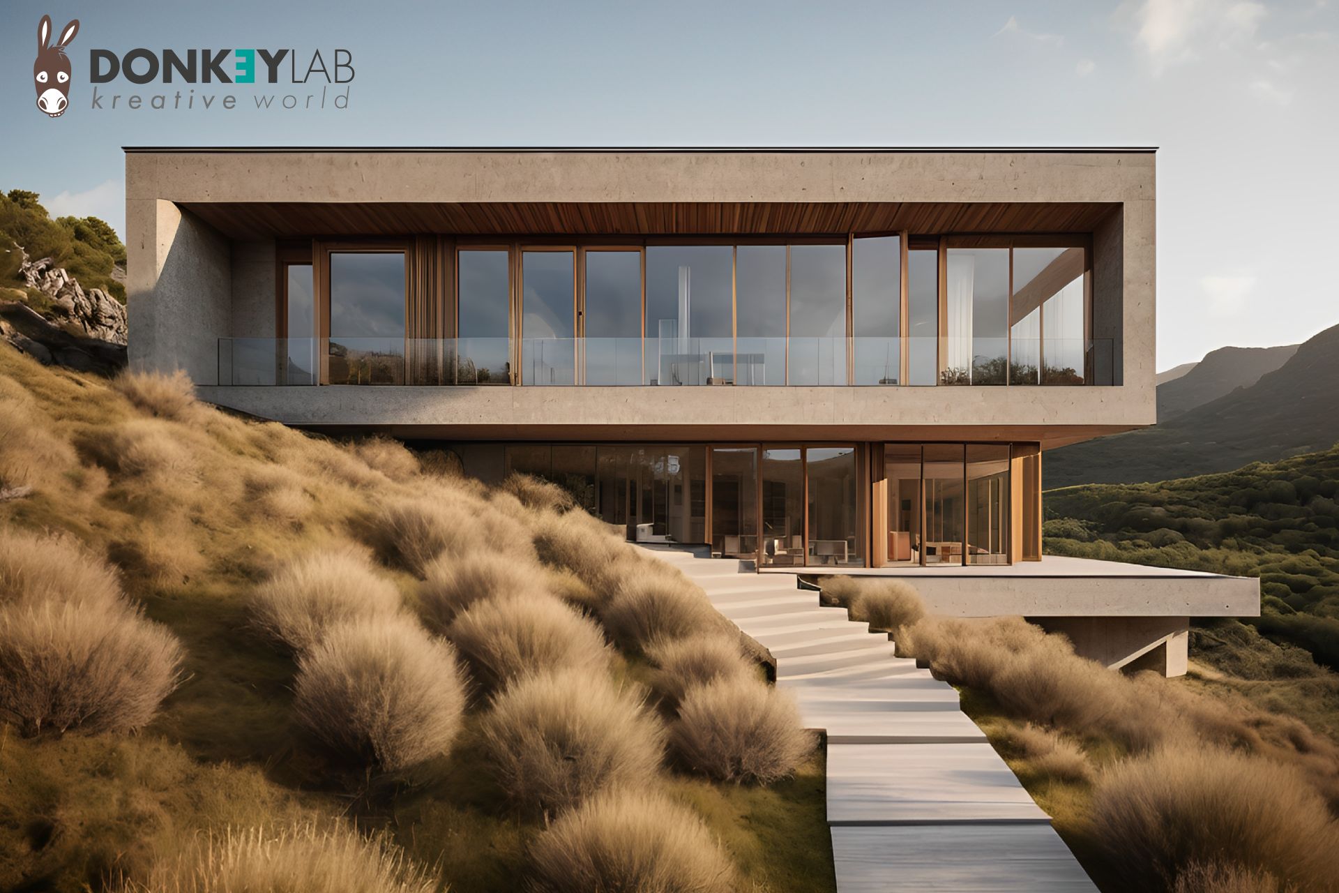
Exterior 3D render of the student residence in Los Realejos, Tenerife

Why 3D renders matter for a building project

A good render is not decoration. It is a working tool that saves time and money at every stage of a project.

  • Better decisions before building. Seeing materials, proportions and light in 3D makes it easy to spot problems and compare options while changes still cost nothing.
  • Clear communication. Not everyone reads technical drawings. Owners, investors, municipalities and future users understand an image immediately.
  • Stronger presentations. Renders are the core of any presentation to investors or partners, and they make a funding request or a planning discussion far more convincing.
  • Sales and pre-sales. For real estate projects, buyers and tenants can see what they are paying for before the building exists. Renders are the base of brochures, websites, listings and signage on site.

Interiors that people can imagine living in

For student housing, interiors matter as much as the facade. The interior renders show how a room works: the bed, the desk, storage, the window and the light it brings in. They also show the shared spaces where students study and meet.

Interior views are useful for the client in two ways. During design they help check layouts and furniture before anything is built. Later they become marketing material that shows students and families what life in the residence looks like.
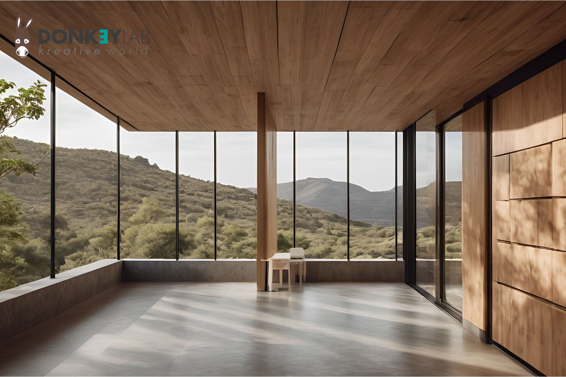
Interior 3D render of a room in the Los Realejos student housing project

Our background: we read plans, not just images

Donkey Lab was founded by a surveyor with years of experience in construction and real estate. That changes how we work on renders: we start from the technical drawings, we understand how a building is put together, and we know what developers and builders need to show. The result is images that look good and are also correct.

We combine this with the rest of our work for the property sector: real estate marketing with 360 Matterport tours and drone footage, branding for agencies and developers, and websites built to sell.

What you get when you order 3D renders

  • A first meeting to understand the project, the audience and how the images will be used
  • A 3D model built from your plans or sketches
  • Draft views to choose camera angles, materials and light
  • Final high-resolution exterior and interior renders
  • Files ready for print, web, social media and presentations

Frequently asked questions

What do I need to start a 3D render project?

Plans or sketches of the building are enough to start. Material references, photos of the plot and examples of images you like help us get closer to your idea from the first draft.

Can you render a project that only exists as a hand sketch?

Yes. This project started from hand sketches. We turn sketches into a 3D model, then into final images.

Do you only work in Tenerife?

No. We are based in Tenerife but work remotely with architects, developers and builders in Spain, Switzerland and the rest of Europe.

Can the renders be used for marketing and sales?

Yes. The final images are delivered in formats ready for brochures, websites, property portals, social media and site hoardings.

Have a project to show?

Whether it is a single house, a residential development or a commercial building, we can help you see it, and show it, before it is built. Take a look at more work in our portfolio or tell us about your project.
GET A QUOTE FOR YOUR RENDERS

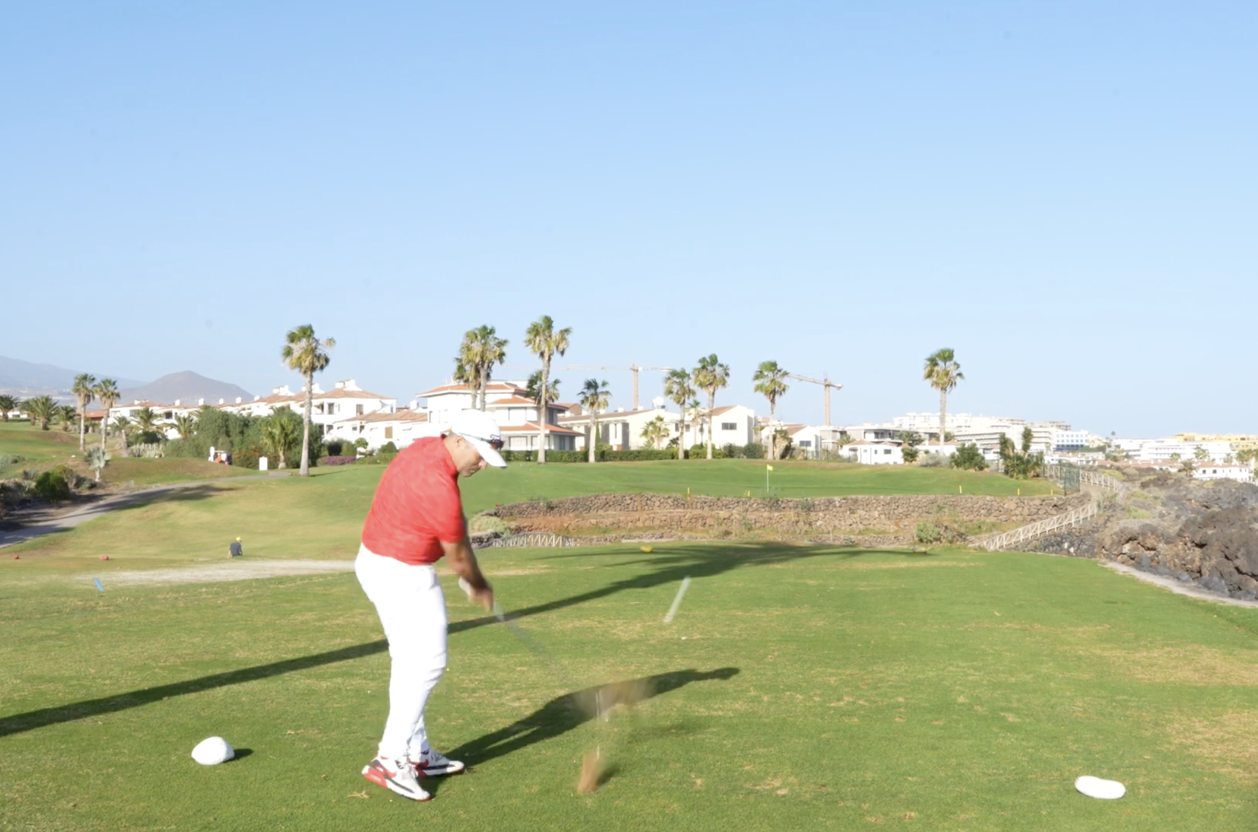
A paper CV tells people what you have done. A video CV shows them who you are. In a couple of minutes it puts your voice, your face and the way you work in front of the people who have to choose you. We produced one for Marco Sammuri, a golf instructor, and this article explains how we did it and how the same approach works for any professional.

Why a video CV works

Recruiters, clubs and clients receive dozens of applications that all look alike. A short, well-made video stands out for three simple reasons:

  • It shows personality. Tone of voice, energy and the way you explain things are hard to put on paper and easy to see on video.
  • It shows the work. For jobs where people watch you do something, like teaching, coaching, hospitality or sales, seeing it is more convincing than reading about it.
  • It is easy to share. A link to a video can go on LinkedIn, in an email, on a website or in a QR code on a printed CV.

For a golf instructor this is even more important. A club or a student wants to know how you teach, how you speak to beginners and how you demonstrate a swing. A video answers all of that at once.

The project: a video CV for a golf instructor

Marco Sammuri needed a presentation that would show both his skills on the course and the way he works with students. The goal was a clean, professional video he could send to clubs and academies and share online.

How we produced it

1. Planning and script

Every good video starts before the camera is switched on. We worked with Marco on what he wanted to say, in what order, and which skills to show on screen. A short script keeps the video focused and avoids long pauses and repetitions.

2. Camera and stability

We shot on a Sony Alpha 7 IV, a full-frame camera that gives sharp, clean images even in changing outdoor light. The camera sat on a Manfrotto Befree Advanced carbon tripod, light enough to move around the course quickly and stable enough for steady shots.

3. A teleprompter for natural delivery

Most people are not used to talking to a camera. To help Marco speak naturally while looking straight into the lens, we used an iPad Pro 12.9″ as a teleprompter. He could follow his text without memorising it, and the result feels like a conversation rather than a recitation.

4. Framing

We chose the framing to show Marco at work: close shots while he talks, wider shots when he demonstrates technique. Changing the framing keeps the viewer’s attention and gives the video rhythm.

5. Editing

The final cut was edited in Adobe Premiere Pro: selecting the best takes, cleaning up the audio, balancing colours and adding simple titles. The aim was a short, polished video where every second has a reason to be there.

Tips for a good video CV

  • Keep it short. One to two minutes is usually enough. People rarely watch longer.
  • Start strong. Say who you are and what you do in the first few seconds.
  • Show, don’t list. Instead of naming your skills, let the viewer see them.
  • Take care of the sound. Viewers forgive average images more easily than bad audio.
  • Use the right setting. Film where you actually work. For Marco, that meant the golf course.
  • End with a next step. Contact details or a link to your profile, so interested people know what to do.

Not only for job seekers

The same approach works for many professionals who sell their own skills: coaches, instructors, consultants, therapists, real estate agents and freelancers. A short presentation video on a website or a Google Business profile builds trust before the first call.

At Donkey Lab we handle the whole process: planning, shooting, editing and delivery of files ready for the web and social media. Photo and video are part of our services, together with websites, branding and real estate visuals.

Watch Marco’s video CV

Frequently asked questions

How long should a video CV be?

Between one and two minutes is ideal. Long enough to introduce yourself and show your skills, short enough to be watched to the end.

Do I need to memorise a script?

No. We use a teleprompter so you can read your text while looking at the camera, which keeps the delivery natural.

Where can I use a video CV?

On LinkedIn, in job applications by email, on your website, on social media and as a QR code on your printed CV.

Can you film outside the studio?

Yes. We prefer to film where you actually work, because the setting tells part of your story.

Want your own video CV?

Tell us what you do and who you want to reach, and we will plan a short video that shows it. See more of our work in the portfolio.

GET A QUOTE FOR YOUR VIDEO

In Tenerife’s property market, dozens of agencies compete for the same buyers, many of them browsing from abroad. The logo is often the first thing those buyers see: on a portal listing, on a sign, on a WhatsApp profile picture. For Sueño Atlántico, a real estate agency in Tenerife, we designed a logo that had to say one thing clearly: high-end property in the Canary Islands.

Why a real estate logo matters so much

Buying a home is a big, emotional decision, and people only hand it to someone they trust. A professional logo is the first signal of that trust. It appears everywhere an agency shows up:

  • property portals and the agency website
  • window displays and office signage
  • “for sale” boards outside properties
  • brochures, business cards and email signatures
  • social media profiles and video watermarks

A weak or generic logo makes an agency look small or temporary. A strong one makes it look established, even when it is new.

The brief: exclusive, refined, rooted in Tenerife

Sueño Atlántico works with quality properties in the Canary Islands. The name itself, “Atlantic Dream”, suggests the ocean, the light of the islands and the idea of a dream home by the sea. The logo had to carry that feeling while staying sober and professional enough for a business that handles important transactions.

Before drawing anything, we looked at the agency’s market: who its buyers are, where they come from, and how competitors present themselves in Tenerife. Understanding the market and the location was the real starting point of the design.

Our process

1. Research and positioning

We analysed the agency’s offer and its competitors to find a visual space that was not already taken. In a crowded market, looking different is half the job.

2. Hand sketches

Ideas start on paper. Hand sketches are fast and let us explore shapes, symbols and lettering freely before committing to any direction.

3. Vector design in Adobe Illustrator

The chosen sketch was rebuilt as a precise vector logo in Adobe Illustrator. Vector files can be scaled to any size without losing quality, from a favicon on a website to a large sign on a building.

4. Right first time

Often a logo goes through several rounds before it is approved. In this case the first proposal already captured what the client wanted to say, and it went ahead with only small refinements. That is usually the result of good preparation: when the brief and the research are clear, the design follows.

5. Applications

A logo only works if it works everywhere. We checked it in colour and in one colour, on light and dark backgrounds, small and large, so the agency could use it on signs, print and digital without surprises.

Originality first

The fastest way to look like everyone else is to copy what is popular. Many property logos use the same roofs, keys and house outlines. They are easy to understand but hard to remember. We always push for an original mark that belongs to one brand only, especially in a market as competitive as Tenerife.

More than a logo

A logo is the beginning of a brand, not the end. For real estate agencies we also design stationery, signage, brochures and websites, and we produce the visuals that sell properties: photography, drone footage and 360 Matterport virtual tours. When everything follows the same identity, the agency looks consistent and professional at every point of contact.

What makes a good real estate logo

  • Readable at small sizes. On portals and phones the logo is often tiny.
  • Works on photos. It will sit on top of property images and videos, so it needs a version that stays visible.
  • Fits the market. A luxury agency and a budget rental agency should not look the same.
  • Memorable. Buyers see many agencies; the logo should be easy to recall when they are ready to call.

What you receive at the end of a logo project

A logo is only useful if it comes with the right files. At the end of a project the client should receive:

  • Vector files (AI, EPS, SVG or PDF) for print, signs and large formats.
  • Image files (PNG with transparent background and JPG) for the web, documents and social media.
  • Colour and one-colour versions, plus a white version for dark backgrounds.
  • Horizontal and stacked layouts, if the logo needs to fit different spaces.
  • Colour codes in CMYK, RGB and HEX, and the names of the typefaces used.

With these files, any printer, web developer or sign maker can use the logo correctly, without asking the designer every time.

Frequently asked questions

How long does a logo design take?

It depends on the project and on how fast feedback comes back, but a clear brief and good research at the start make the process much shorter.

What files do I receive?

Vector files for print and signage, plus image files for web and social media, in colour and one-colour versions.

Do you only design logos for real estate agencies?

No. Real estate is one of our main sectors, but we design identities for businesses of every kind in Spain, Switzerland and Italy.

Can you redesign an existing logo?

Yes. A restyling keeps what people already recognise and fixes what no longer works.

Need a logo that sells?

See more identity work in our portfolio or tell us about your business.

GET A QUOTE FOR YOUR LOGO

For a real estate agency, the website is the shop window that never closes. Buyers search for property online long before they call anyone, and they judge an agency by its site in a few seconds. For Moai Real Estate we designed a website built for an agency that was starting out and needed a professional presence on a limited budget.

What a real estate website has to do

A property website is not a brochure. It is a working tool with a few clear jobs:

  • Show the properties clearly, with good photos and the key information buyers look for first: price, location, size, rooms.
  • Help people search and filter, so they find what fits them quickly.
  • Turn visits into enquiries with simple, visible contact forms.
  • Build trust with a professional design that matches the agency’s identity.
  • Work on every device, because most property searches happen on a phone.

The design: modern and minimal

We chose a modern, minimal design that puts the properties at the centre. Clean layouts, plenty of white space and large images let the homes speak for themselves. A minimal design also has a practical advantage: it is fast to load and easy to maintain.

Navigation is simple. Visitors always know where they are and how to get back to the listings, which keeps them on the site longer and makes enquiries more likely.

Responsive on every screen

The site adapts to phones, tablets and desktops. On a phone, listings stack in a single column, buttons are large enough to tap, and contact options are always within reach. For an agency whose clients often browse from abroad, on the move, this is essential.

Built to grow with the agency

Every agency is different, and a young agency changes fast. The site was designed to be adapted over time:

  • Colours and layout follow the agency’s brand and can be updated.
  • Property search with filters by area, type and price.
  • Information requests on each listing, so enquiries arrive with the right property attached.
  • User accounts where buyers can save properties and receive updates.

Starting simple and adding features later keeps the first investment low while leaving room to grow.

Efficient by design

A good real estate site is measured by what it produces, not by how it looks. Every page was designed to help visitors find what they want quickly and get in touch without friction. Fewer steps between “I like this house” and “I sent a request” means more real enquiries for the agency.

Websites for real estate agencies at Donkey Lab

Real estate is one of the sectors we know best. Our founder worked in construction and property for years before moving into marketing, so we understand how agencies sell and what buyers need to see. Besides websites, we produce the visuals that make listings stand out: professional photography, drone footage and 360 Matterport virtual tours.

If you are starting out, our website packages include design, hosting, basic SEO and maintenance in one monthly fee.

Mistakes that cost agencies enquiries

  • Slow pages. Heavy images and plugins make listings load slowly, and visitors leave before they see the house.
  • Hidden contact options. If the phone number or the contact form is hard to find, interested buyers give up.
  • Poor photos. Dark, crooked or blurry pictures make even a good property look unattractive.
  • Outdated listings. Properties already sold that are still online frustrate buyers and damage trust.
  • No local SEO. Without basic optimisation and a Google Business profile, the agency is invisible to people searching nearby.

A simple, fast and well-maintained site avoids all of these, and does more for an agency than a complicated one.

Starting small, the right way

A new agency does not need every feature on day one. It needs a professional site that loads fast, presents properties well and makes contact easy. Search filters, accounts and multilingual content can be added as the business grows. Building on a solid base from the start means these additions are simple and do not require starting again.

What to check before launching a real estate website

Before a property website goes live, a short checklist avoids most problems:

  • Speed: compress every photo and test the pages on a mobile connection.
  • Listings: check that every property has price, size, location, photos and a contact button.
  • Forms: send a test enquiry from each form and confirm it arrives in the right inbox.
  • SEO basics: unique titles and descriptions for the main pages and the property pages.
  • Legal pages: privacy policy, cookie banner and legal notice, as required in the countries where the agency works.
  • Analytics: Google Analytics and Search Console connected from day one, so results can be measured.

Frequently asked questions

Can I add properties myself?

Yes. The site is built so the agency can add, edit and remove listings without technical help.

Does the site work on mobile phones?

Yes. It is fully responsive and designed mobile first, because most property searches happen on a phone.

Can the website grow with my agency?

Yes. You can start with the essentials and add features like advanced search, user accounts or new languages later.

Do you also take the property photos?

We can. We offer professional photography, drone footage and 360 virtual tours for listings.

Need a website for your agency?

See more of our work in the portfolio or tell us what you need.

SEE WEBSITE PACKAGES

Some agencies only sell. Others sell, rent long term and manage holiday apartments at the same time. Borza Real Estate does all three, and needed a website that could handle every part of the business in one place. We built a custom real estate website with online booking for holiday rentals, synced with the main rental platforms.

One website, three businesses

Sales, long-term rentals and holiday lets have different customers and different needs:

  • Buyers want detailed information, many photos and a way to ask questions or book a visit.
  • Long-term tenants look for availability, conditions and a quick way to apply.
  • Holiday guests want to see dates, prices and book immediately, without waiting for a reply.

The website had to serve all of them clearly, without turning into a confusing mix of everything.

Holiday rentals with online booking

The key feature of the site is a dedicated section for holiday apartments. Guests can browse the apartments, check availability and book their stay online directly on the agency’s website.

The booking system is synchronised with the most used rental platforms. When a date is booked on one channel, it is blocked everywhere else. This prevents double bookings and saves the agency hours of manual updates, while every direct booking on the website avoids the commission charged by the big platforms.

Presentation that sells and rents

Whether people are buying a home or booking a week by the sea, they decide with their eyes. That is why the site is backed by high-quality visual content:

  • Professional photography that shows each property in its best light.
  • Virtual tours that let visitors walk through a home from anywhere in the world.
  • Drone footage that shows the building, the surroundings and the views.

Together they give visitors a complete and honest view of each property, which increases enquiries and reduces wasted visits.

A custom site, not a template

The site was built around how Borza Real Estate actually works, not adapted from a generic template. That means the structure, the listing pages and the booking flow follow the agency’s real processes. The team can update listings, prices and availability without technical help.

Fast, clear and easy to use

A real estate site has to work on the phone first, load quickly and make the next step obvious: book, call or send a request. Every page is designed so visitors never have to look for the contact button.

Real estate websites by Donkey Lab

We build websites for agencies, developers and property managers, and we produce the visual content that makes them work: photography, drone footage and 360 Matterport tours. Our website packages include an interactive option designed for real estate agencies.

Direct bookings: why they matter

Holiday rental platforms bring visibility, but they charge commissions on every booking and own the relationship with the guest. A website with its own booking system lets an agency:

  • keep more of each booking, without platform fees on direct reservations;
  • own the guest relationship, with the contact details to invite returning guests;
  • set its own conditions for cancellations, deposits and offers;
  • build its own brand instead of being one listing among thousands.

Platforms and the website work best together: the platforms bring new guests, the website turns them into direct, repeat customers.

What to prepare before building a site like this

  • The list of properties for sale, for rent and for holiday lets, with their main details.
  • Good photos of each property, or a plan to shoot them.
  • The rental platforms currently in use, to set up calendar synchronisation.
  • Prices, seasons and booking conditions for the holiday apartments.

With this information ready, the project moves faster and the site goes live with complete, accurate content.

Keeping a real estate website alive after launch

A property website is never really finished. Listings change every week, and a site full of sold properties tells visitors the agency is not active. A few habits keep it working:

  • Update listings promptly, marking sold or rented properties or removing them.
  • Add new content regularly, such as area guides or market updates, which also helps SEO.
  • Keep WordPress, the theme and plugins updated for security and speed.
  • Back up the site automatically, so nothing is lost if something goes wrong.
  • Review enquiries and analytics monthly, to see which pages and properties attract interest.

We offer ongoing support for clients who prefer to leave these tasks to us.

Frequently asked questions

Can guests book holiday apartments directly on the website?

Yes. The site includes online booking, so guests can check availability and book without going through an external platform.

How do you avoid double bookings with other platforms?

The booking calendar is synchronised with the main rental platforms, so dates booked on one channel are blocked on the others.

Can the same site handle sales and long-term rentals?

Yes. Sales, long-term rentals and holiday lets each have their own section and their own type of enquiry.

Do you provide the photos and virtual tours?

Yes. We offer professional photography, drone footage and 360 virtual tours for every listing.

Want a website like this?

See more of our work in the portfolio or tell us how your agency works.

GET A QUOTE

Most logos live on screens and paper. Some also have to live in three dimensions: on the front of an office, above a door, on a reception wall. For Atlantis Real Estate in Tenerife we designed a 3D logo: a gold symbol on a dark background, created to stand out on the agency’s sign and to work just as well on its website and stationery.

What a 3D logo is, and when it makes sense

A 3D logo has depth. Instead of a flat drawing, the mark is designed with volume, light and shadow, so it looks like a real object. It makes sense when the logo will be built physically, for example as a sign with raised letters, or when the brand wants a richer, more premium look in its visuals.

A good 3D logo is always designed together with a flat version. The 3D mark gives impact on signs and in videos; the flat version keeps the brand readable on documents, small screens and one-colour printing.

The brief: elegance for a property agency

Atlantis Real Estate wanted a logo that would communicate quality and exclusivity, two things buyers look for when they choose who will help them with a property. The agency also needed a mark that would be easy to recognise from the street.

Gold on dark: contrast and elegance

We chose a gold symbol on a dark background. The contrast makes the mark visible from a distance and gives it a sense of depth. Gold is associated with value and quality; dark backgrounds feel solid and refined. Together they suggest a premium service without being loud.

On the sign, the 3D treatment of the gold mark catches the light during the day and at night, so the agency stays visible at every hour.

How we designed it

1. Concept and symbol

We started from the name and from what the agency wanted to express, sketching several symbols before choosing one that was simple enough to recognise at a glance.

2. Flat vector version

The symbol was first drawn as a clean vector logo. This is the base for every application and guarantees sharp results at any size.

3. 3D modelling

From the flat version we built the 3D mark, working on depth, materials and light to obtain a realistic gold finish.

4. Sign and applications

We prepared the logo for the office sign and checked it on every other use: website, business cards, letterheads, property boards and social media.

One identity, every touch point

A logo is most effective when it appears the same way everywhere. For Atlantis Real Estate, the same mark connects the sign on the street with the website, the documents clients receive and the listings they see online. That consistency is what turns a logo into a recognisable brand.

Logos and signage at Donkey Lab

We design logos, corporate identities and signage, and we know how to take a design from the screen to a physical sign. For real estate agencies we also produce the visuals that sell properties: photography, drone footage, 360 Matterport tours and 3D renders.

Signs that work day and night

A sign is often the first contact with a business. For an agency on a busy street, it has to be readable from a distance, recognisable at a glance and visible in the evening as well as during the day. Some practical points we consider when a logo becomes a sign:

  • Viewing distance. The size of the symbol and the letters depends on where people will see the sign from: across the street, from a car, from the pavement.
  • Contrast. Strong contrast, like gold on dark, keeps the logo readable in bright sun and at dusk.
  • Materials and finish. Metallic finishes, raised letters and lighting change how a logo catches the light.
  • Local regulations. Many towns have rules on the size and lighting of signs, which have to be checked before production.

Why premium brands use depth

Luxury and premium brands often use depth, metallic tones and dark backgrounds because they suggest solidity and value. In real estate, where clients entrust an agency with one of the biggest purchases of their life, these signals matter. A 3D logo is one way to communicate quality before a single word is read.

Frequently asked questions

Do I need a 3D logo?

Not always. A 3D version is useful for signs, videos and premium visuals. Every brand needs a strong flat logo first.

Will the 3D logo work on business cards and documents?

We always deliver a flat version as well, designed for print, documents and small sizes.

Can you prepare the files for the sign maker?

Yes. We provide vector files and technical indications for the production of the sign.

Can you turn my existing logo into 3D?

Yes, as long as the logo is clear enough to work with depth. We check it first and suggest small adjustments if needed.

Want a logo that stands out?

See more identity and signage work in our portfolio.

GET A QUOTE

Renewable energy is a technical product sold to people who are not technicians. Families and businesses want to save money and do the right thing, but they also want to understand what they are buying. For Generazione Green, a renewable energy company based in Milan, Italy, we designed a complete set of printed sales material: brochures, technical sheets, quote forms and a magazine template.

The company grew fast in those years, reaching €28 million in sales in under two years, and its sales team needed material that could keep up: clear, consistent and convincing.

Why printed material still matters in renewable energy

Solar panels, batteries and heat pumps are often sold in person, at the customer’s home or at events. In those moments a well-designed brochure does three jobs:

  • it gives the salesperson a clear structure for the conversation;
  • it leaves the customer something to read and compare after the meeting;
  • it makes a young company look solid and trustworthy.

Brochures: the face of the brand

Each brochure was designed to reflect the identity and values of Generazione Green and to introduce its products and services visually. Strong images, short texts and a clear hierarchy let readers understand the offer in a few minutes. The aim was simple: make the customer want to know more.

Technical sheets: key data at a glance

Customers who are seriously considering a purchase want the details. We turned technical information into sheets that can be read at a glance: main features, benefits and data organised so that the important numbers stand out. Good layout makes technical content approachable without hiding anything.

Quote forms: from interest to request

A sale starts with a request. We designed quote forms that are simple and intuitive, so customers can ask for information or a quote without hesitation. Every unnecessary field removed is one less reason to give up.

A magazine for ongoing communication

To stay in touch with customers and partners, we created a stapled magazine template. It lets the company publish news, articles and updates on renewable energy with a consistent look, issue after issue. The template is flexible enough to adapt to different content while staying on brand.

One identity across every piece

Brochures, sheets, forms and magazine all follow the same visual rules: colours, typography, images and tone of voice. When a customer receives several documents, they feel like one company speaking with one voice. That consistency builds trust, and trust is what closes a sale.

How we worked

Every piece was designed in close collaboration with the client’s team, starting from what the sales people needed in front of customers. We worked on the content and the layout together, so the material was useful in real sales situations, not just good-looking.

Brochure and print design at Donkey Lab

We design brochures, catalogues, technical sheets, magazines and all the printed material a sales team needs, as part of a complete brand and marketing service. We also build the websites that carry the same identity online.

Tips for effective sales material

  • One message per page. Each page or panel should answer one question the customer has.
  • Benefits before specifications. Start with what the customer gains, then give the technical data.
  • Real images. Photos of real installations convince more than stock images.
  • A clear next step. Every piece should end with how to request a quote or a visit.
  • Consistent design. Using the same templates saves time and keeps the brand recognisable.

These principles apply to any technical product, not only renewable energy: machinery, building systems, software or professional services.

Printing a brochure: practical tips

The printing stage can make or break a brochure. A few choices make a real difference:

  • Paper: for an eco-friendly project, recycled or FSC certified paper reinforces the message.
  • Weight: a heavier cover and lighter inner pages give a quality feel without increasing costs too much.
  • Finish: matte papers suit natural, sustainable brands better than glossy ones.
  • Quantity: digital printing is cost-effective for small runs, offset for larger ones.
  • Proofs: always check a printed proof before the full run, especially for colours.

We prepare print-ready files and can coordinate production, so the finished brochure matches the design on screen.

Frequently asked questions

Do you write the texts as well as the layout?

We can. We work from your information and help structure and write the content so it is clear for your customers.

Can you design technical sheets for complex products?

Yes. Making technical information easy to read is one of the main goals of a good product sheet.

Do you also handle printing?

We deliver print-ready files and can coordinate production with the printer.

Can the same material be used online?

Yes. We prepare digital versions for email, the website and social media.

Need sales material that works?

See more print work in our portfolio or tell us about your product.

GET A QUOTE

A T-shirt, a sweatshirt or a polo with your logo is one of the most visible forms of branding there is. It walks through the streets, appears in photos and shows up at every event your team attends. At Donkey Lab we design custom branded clothing for companies, teams, events and individuals, and we follow production until the finished garment is in your hands.

Why custom clothing works for a brand

  • Visibility. Every person wearing your clothing is a moving advertisement.
  • Team identity. Uniforms and team wear make staff recognisable and give a sense of belonging.
  • Professional image. A team dressed consistently looks organised and reliable to customers.
  • Memorable gifts. Good-quality branded clothing is kept and used, unlike many promotional items.

Design first

Custom clothing is not just a logo printed on a shirt. A good design considers where the logo goes, how big it is, which colours work on which fabrics, and whether there is room for a message, a slogan or a design on the back. We design each garment around your idea and your brand, so it says exactly what you want it to say.

We prepare visual mockups before production, so you can see the result on the real garment and approve it with confidence.

Our process

1. Brief

We start from how the clothing will be used: daily uniforms, an event, a sports team, merchandise to sell or gifts for clients. The use decides the type of garment, the fabric and the quantity.

2. Design and mockups

We design the graphics and show them on mockups of the chosen garments, in the real colours.

3. Materials and technique

Depending on the design and the fabric, the best technique may be screen printing, digital printing, transfer or embroidery. Each has strengths in durability, detail and cost, and we help you choose.

4. Production and quality control

Once the design is approved, we follow production in every detail, from the choice of fabric to the final finish, so the result matches what you approved.

Options to choose from

  • T-shirts, polo shirts, sweatshirts, hoodies and jackets
  • caps, bags and other accessories
  • a wide choice of colours and fabrics
  • prints, embroidery and special finishes
  • single pieces or full runs for a team or an event

Quality materials

Clothing that fades or loses shape after a few washes damages the brand it carries. We work with quality materials so that garments stay comfortable and look good for a long time. The quality of the fabric matters as much as the design.

For every need

Custom clothing works for many situations: corporate uniforms for shops, restaurants and offices, event clothing for staff and volunteers, team wear for sports clubs, merchandise to sell, and personal pieces for special occasions. We have designed clothing for our own brand, Donkey Lab, as well as for clients.

Part of a complete identity

Clothing is most effective when it matches the rest of your brand: logo, colours, signage, website and printed material. At Donkey Lab we design all of these, so your team’s clothing looks like it belongs to the same company as your website and stationery.

Tips for branded clothing people actually wear

  • Choose good garments. People wear what is comfortable and fits well.
  • Keep the logo discreet on everyday clothing; save large graphics for events and merchandise.
  • Offer the right sizes. Check sizes with your team before ordering.
  • Match colours to the brand, but also to what people like to wear.

Choosing the right garments and printing method

The result of a custom clothing project depends as much on the garment and the technique as on the design:

  • Screen printing is durable and cost-effective for larger quantities with few colours.
  • Embroidery gives a premium look, ideal for polo shirts, jackets and caps.
  • Digital transfer or DTG printing suits small runs and designs with many colours.
  • Garment quality matters: a good design on a cheap shirt still looks cheap after a few washes.

We adapt the design to the technique chosen, simplifying details where needed, so the logo stays sharp and readable on every garment.

Frequently asked questions

Is there a minimum order?

It depends on the technique. Some methods are suitable for single pieces, others become convenient from a certain quantity. We suggest the best option for your numbers.

Can I see the result before production?

Yes. We prepare mockups of the design on the chosen garments before anything is produced.

Which is better, print or embroidery?

Embroidery is durable and elegant for small logos; printing allows larger and more detailed designs. The choice depends on the design and the use.

Do you design the graphics if I don’t have a logo?

Yes. We can design the logo and the graphics as well as the clothing.

Ready to dress your brand?

See more of our work in the portfolio or tell us what you need.

GET A QUOTE

A logo on its own is not a brand. A brand is the impression people get every time they meet your company: on a business card, in an email, on the website, on an invoice. Corporate identity design is the work of making all those moments look and feel like the same company. Here is how we approached it for our own studio, Donkey Lab, and what every business should consider.

What corporate identity includes

Corporate identity is the system of visual rules that a company uses everywhere:

  • the logo and its variations
  • the colour palette
  • the typography
  • the style of images and graphics
  • the way these elements are combined on every document

When these rules are clear and applied consistently, people recognise the company instantly, even before reading its name.

Corporate stationery: the everyday face of a brand

Stationery is where identity is used most often, and where inconsistency shows first.

Letterheads

Every letter, quote and contract carries the letterhead. It must include the logo and the company’s details in a clean layout that leaves room for the content.

Business cards

The business card is often the first physical contact with a client. Paper, printing and layout all say something about the company.

Envelopes

A small detail that is often forgotten. The envelope is the first thing a client sees when they receive your documents, and it should belong to the same family as everything inside.

The website: the brand’s window to the world

Today most people meet a company online first. The website has to follow the same identity as the printed material, with the same colours, typefaces and tone. It also has to work: be fast, easy to navigate and optimised for search engines so people actually find it.

Diaries and calendars

Branded diaries and calendars keep the identity present every day, on the desks of the team and of clients. They are practical objects that people keep for a whole year, which makes them one of the most effective promotional items.

Why consistency matters

Every time someone sees your brand, the impression adds up. If the logo looks different on the website and on the business card, or the colours change from one document to another, the impressions do not add up: they cancel out. Consistency is what turns many small contacts into a strong, recognisable brand.

How we build a corporate identity

1. Understanding the company

We start from who the company is, who its customers are and how it wants to be perceived.

2. Logo and visual system

We design or refine the logo and define colours, typography and graphic style.

3. Applications

We apply the system to stationery, website, signage, social media and any other material the company uses.

4. Delivery

We hand over all files, ready to print and to use online, with simple rules on how to use them.

Our own identity

As a design studio, our own identity is also our business card. The Donkey Lab identity, with the donkey symbol and the teal colour, is used consistently on our stationery, website, clothing and social media. It is the same approach we bring to our clients.

See how we apply it to clients in our portfolio, and what else we do on the services page.

Signs your identity needs attention

  • Your logo looks different on the website, the van and the business cards.
  • Every new document is designed from scratch, in a different style.
  • The logo file you have is a low-quality image that pixelates when enlarged.
  • Customers confuse you with a competitor.
  • Your brand no longer reflects what the company has become.

If any of these sound familiar, a review of the identity is usually faster and cheaper than people expect, and it pays off every day in the way customers perceive the business.

Keeping a brand consistent over time

Designing an identity is the first step; using it consistently is what makes it work. Over the years, small inconsistencies creep in: a stretched logo on a flyer, a slightly different colour on a sign, a new typeface on social media. Together they weaken the brand.

A few simple tools prevent this:

  • a short brand guide with logo rules, colours and typefaces;
  • ready-made templates for documents, presentations and social posts;
  • a shared folder with the official logo files, so nobody uses an old version;
  • one person responsible for checking new materials before they are published.

We apply the same discipline to our own brand and to the identities we design for clients.

Frequently asked questions

What is the difference between a logo and a corporate identity?

The logo is one element. Corporate identity is the whole system of logo, colours, typography and rules applied to everything the company uses.

Do small businesses need a corporate identity?

Yes. A consistent identity makes a small business look established and trustworthy, often more than its size would suggest.

Can you update an existing identity?

Yes. We can refresh an identity while keeping the elements customers already recognise.

Do you also print the stationery?

We deliver print-ready files and can coordinate printing for you.

Want a brand people remember?

GET A QUOTE

A gift says more when it is clearly made for the person who receives it. For Manor, the Swiss department store chain, we designed custom Christmas labels and packaging for jars of jam given as a Christmas gift to its employees. A small project with a simple goal: turn a jar of jam into a present that feels personal and special.

Why labels matter

On a food product the label is the first thing people see and the thing they remember. It tells them what is inside, but also who it comes from and how much care went into it. A plain jar is just food; the same jar with a well-designed label becomes a gift.

For a company gift to employees, the label also carries a message from the company: thanks for the year of work, and best wishes for the holidays.

The project: Christmas gifts for Manor employees

Manor wanted a Christmas gift for its staff that was simple, warm and of good quality. The choice was jars of jam with dedicated packaging and labels. We designed:

  • personalised Christmas labels for the jars;
  • packaging to present each jar as a gift;
  • a design that matched the Christmas season and the Manor Food brand.

Designing a food label

Clear information

A food label must say clearly what the product is. Even on a gift, the flavour and the essential information have to be easy to read.

The right atmosphere

Colours, illustrations and typography set the mood. For Christmas that means warmth and festivity without falling into clichés.

Brand consistency

The labels had to belong to the company that gives them. Logo and visual style connect the gift to the brand.

Practical constraints

Size of the jar, shape of the label, type of paper and printing method all affect the design. We prepared files that fit the real jars and print correctly.

Packaging that completes the gift

The packaging turns a product into a present. It protects the jar, makes it easy to hand out, and creates a small moment of surprise when it is opened. Together with the label, it makes the gift feel complete and cared for.

Ideas for corporate Christmas gifts

Custom labels and packaging work for many kinds of corporate gifts:

  • jams, honey, oil and other local food products;
  • wine and spirits with personalised labels;
  • chocolates and sweets in branded boxes;
  • gift boxes combining several products.

The product can be simple; it is the design that makes it memorable.

Not only for Christmas

The same approach works all year round: labels for food producers, wine labels, packaging for shops and restaurants, gifts for anniversaries, events and clients. We also designed the Christmas dinner kit with menu and wine cards, part of our print work for the food sector.

Labels and packaging at Donkey Lab

We have worked with Swiss clients for many years, including large retailers like Manor. Label and packaging design is part of our graphic design services, together with branding, print and websites.

From design to the finished jar

A label project follows a few simple steps:

  • Brief. Product, quantity, occasion, message and deadline.
  • Measurements. We take the real dimensions of the jar or bottle, because a label that does not fit ruins the result.
  • Design proposals. We present the design on a realistic mockup of the product.
  • Approval and files. After approval we prepare print-ready files with the correct margins and colours.
  • Printing. We advise on paper, adhesive and finish, for example matte, gloss or textured paper.

Small details, big effect

Corporate gifts are often forgotten quickly. A personalised label and careful packaging change that: the gift is kept, photographed and remembered. For a company, it is an inexpensive way to show attention to its people and to strengthen its brand at the same time.

Planning a seasonal packaging project

Christmas labels have a fixed deadline that cannot move, so timing is part of the design. A realistic schedule works backwards from the date the products must be on the shelf:

  • Brief and concept: agree on style, products and quantities early in the autumn.
  • Design and proofs: leave time for revisions and for checking all legal text on the labels.
  • Printing: printers are busiest before the holidays, so book production in advance.
  • Labelling and distribution: allow time to apply the labels and deliver the products.

Starting early avoids rushed decisions and extra costs, and leaves room to adapt the same design for gift boxes, tags or social media.

Frequently asked questions

Can you design labels for my food products?

Yes. We design labels for food producers, shops and companies, for sale or as gifts.

Do you prepare files for printing?

Yes. We deliver print-ready files sized for your jars, bottles or boxes.

How early should I plan Christmas gifts?

We recommend starting at least a couple of months before, to leave time for design, approval and printing.

Can each label be personalised with a name?

Yes. Labels can include names or messages for each recipient.

Planning your company gifts?

See more of our work in the portfolio.

GET A QUOTE

A Christmas dinner is an experience, and the printed material around it is part of that experience. A menu that looks good, an invitation that makes people want to book, a poster that catches the eye at the entrance. We designed a complete Christmas dinner kit: menu, booking request, poster and small cards with information about each wine.

Why a complete kit

When each piece is designed separately, the result often looks improvised: a menu in one style, a poster in another, booking forms printed in a hurry. A kit designed as one project gives the event a single, recognisable look, from the first announcement to the table.

What the kit includes

The menu

The menu is the centre of the kit. It presents each course clearly, with a layout that is easy to read in the soft light of a dining room. Typography and decoration create the festive atmosphere without making the text hard to read.

The booking request

To fill the tables, guests need an easy way to book. A clear booking request with the date, the price and the information needed makes it simple to say yes.

The poster

The poster announces the dinner at the entrance, in the window or on a notice board. It has to be readable from a distance and make the event attractive at a glance.

Wine cards

Small cards, in business-card format, give guests information about each wine served: origin, grape and characteristics. They add value to the dinner and help guests appreciate what they are drinking.

Designing for a festive event

Christmas design is full of clichés. The challenge is to create a festive feeling while keeping the material elegant and in line with the restaurant or company that organises the dinner. We work with colour, typography and a few well-chosen decorative elements rather than covering everything in stars and snowflakes.

Readability always comes first. A beautiful menu that guests cannot read is a bad menu.

Print quality makes the difference

Paper and printing change how a menu feels in the hand. A heavier paper, a matte finish or a special detail can make a simple design feel premium. We prepare print-ready files and advise on the best paper and finish for each piece.

For restaurants, hotels and companies

A Christmas kit works for:

  • restaurants and hotels organising a Christmas or New Year dinner;
  • companies hosting a dinner for staff or clients;
  • wine bars and wineries organising tasting dinners;
  • event organisers who need a coordinated look for a gala evening.

Beyond Christmas

The same approach works for every special event: Valentine’s Day, Easter, summer evenings, weddings, anniversaries and tasting menus. A coordinated set of printed material makes any event look more professional and more memorable.

We also design permanent menus, wine lists, signage and websites for restaurants, as well as Google Business profiles that help local customers find you.

Tips for a menu guests enjoy reading

  • Keep it short. A clear list of courses reads better than long descriptions.
  • Use a readable size. Dining rooms are often dimly lit, so text must not be too small.
  • Mark allergens clearly. Guests appreciate clear information, and in many countries it is required.
  • Pair wines visibly. Showing which wine goes with which course helps guests and adds value.
  • Check every word. A typo on a printed menu is seen by every guest.

Promoting the dinner

Printed material works best together with online promotion. The same design can become a post for social media, an email to regular customers and an event on the restaurant’s Google Business profile. A coordinated campaign fills tables faster than a poster alone.

Printing and using the menu

A Christmas menu is often used in several ways at once, and planning for that saves time and money:

  • Printed menus on the tables, on a quality paper that matches the style of the restaurant.
  • A PDF version to send to customers who book by email or WhatsApp.
  • Social media images to announce the menu and the booking dates.
  • A page on the website, so customers searching for a Christmas dinner nearby can find it.

Designing all formats together keeps the style consistent and makes the menu easy to promote. It is also worth preparing the files early, so the menu can be shared well before the holiday bookings start.

Frequently asked questions

Can you design only the menu?

Yes. You can order a single piece or the complete kit.

Do you also prepare digital versions?

Yes. We prepare versions for social media, email and your website to promote the event.

How long does it take?

It depends on the number of pieces, but we recommend starting a few weeks before the event to leave time for printing.

Can you include our logo and colours?

Yes. The kit is always designed around your brand.

Planning an event?

See more print work in our portfolio.

GET A QUOTE

In a digital world, the business card is still one of the few things a client physically takes away from a meeting. It goes into a wallet, onto a desk, into a drawer, and comes out again when the client needs you. For Fenice, an insurance business, we designed and produced business cards featuring a phoenix, printed on recycled FSC paper.

Why a business card still matters

A business card does more than share a phone number:

  • It is a first impression you can touch. The weight of the paper, the finish and the print quality say something about the business before the client reads a word.
  • It is remembered. A well-designed card is kept; a cheap, generic one is thrown away.
  • It works offline. At meetings, events and on site visits, it is still the fastest way to leave your details.
  • It reinforces the brand. Every card handed out is another contact with your identity.

The concept: the phoenix

“Fenice” means phoenix in Italian: the mythical bird that rises again from its ashes. It is a strong symbol of protection, renewal and continuity, values that fit naturally with insurance. We built the card around this image, so the name and the symbol tell the same story.

The phoenix makes the card distinctive and easy to remember. When clients look for their insurance contact, the bird is what they recognise first.

Technical specifications

Good design needs good production. For this project we chose:

  • Paper: recycled paper certified FSC™, 300 g
  • Format: horizontal, 8.5 x 5.5 cm
  • Printing: full colour on both sides (4/4)

A 300 g paper gives the card a solid, quality feel in the hand. Printing on both sides leaves room for the symbol on one side and clear contact details on the other.

Why recycled FSC paper

The FSC certification guarantees that the paper comes from responsibly managed sources. Choosing recycled, certified paper is a small but visible sign that a company cares about its impact, and many clients notice and appreciate it. Today, quality recycled papers look and feel as good as virgin paper.

How to design a good business card

Essential information only

Name, role, phone, email, website and, if needed, address. Everything else is noise.

Readable sizes

Contact details must be readable without effort. Text that is too small looks elegant on screen and fails in real life.

Consistent with the brand

The card should use the same logo, colours and typography as the rest of the identity.

A distinctive element

A symbol, a colour, a texture or a special finish makes the card memorable. For Fenice, it is the phoenix.

Print-ready files

Bleed, safety margins and the correct colour profile prevent unpleasant surprises when the cards arrive from the printer.

Finishes that make a difference

Beyond the paper, special finishes can lift a simple design:

  • matte or soft-touch lamination for a velvety feel;
  • spot UV varnish to highlight the logo;
  • foil stamping in gold or silver;
  • embossing for a raised, tactile effect;
  • rounded corners or unusual formats.

We recommend finishes based on the brand and the budget, so the card stands out without unnecessary costs.

Business cards and stationery at Donkey Lab

We design business cards as part of a complete identity, together with letterheads, envelopes, signage and websites. We prepare the files and can coordinate printing, so you receive finished cards ready to use. See more on our services page.

Common business card mistakes

Many cards fail for the same reasons:

  • Too much information: every service, every social network and a slogan on a tiny surface.
  • Text too close to the edge, which risks being cut during trimming.
  • Low-resolution logos that look blurry once printed.
  • Colours that do not match the rest of the brand, because the file was prepared in RGB instead of CMYK.
  • Outdated details, such as an old phone number or a website that no longer exists.

A short check before printing avoids all of these.

Business cards in the digital age

A printed card and a digital presence work best together. A QR code on the back can open a contact card, a website or a booking page, so the client saves your details in one tap. The card starts the relationship; the website and online profiles continue it. That is why we design cards in line with the rest of the identity and the website.

Frequently asked questions

What is the standard size of a business card?

In Europe the most common size is 8.5 x 5.5 cm, which fits standard card holders and wallets.

What paper weight do you recommend?

Around 300 g or more gives a solid, quality feel. Thinner papers feel cheap in the hand.

Is recycled paper good quality?

Yes. Modern recycled FSC papers print well and feel premium, and they show care for the environment.

Can you redesign my existing cards?

Yes. We can refresh your current cards or design new ones as part of a complete identity.

Need new business cards?

See more stationery work in our portfolio.

GET A QUOTE

For therapists and wellness professionals, trust is everything. Clients choose someone they feel comfortable with, often after a single recommendation or a short meeting. A business card is one of the small tools that builds that trust. We designed and printed business cards for Benatelli, a massage therapist in Switzerland, and this article shares what we consider when designing for this kind of professional.

Why therapists still need business cards

Much of a therapist’s work comes from word of mouth. A happy client recommends you to a friend, a colleague, a family member. A business card makes that recommendation easy: the client simply hands it over. Cards are also useful:

  • on the reception desk or in the treatment room, for clients to take;
  • at gyms, clinics, spas and partner businesses;
  • at events, fairs and workshops;
  • as appointment cards, with space to write the next session.

Designing for a wellness professional

A therapist’s card should communicate calm, care and professionalism. That affects every design choice:

Colours

Soft, natural colours usually work better than loud ones. They suggest relaxation and wellbeing.

Typography

Clear, gentle typefaces that are easy to read. Contact details must be readable at a glance.

Simplicity

White space gives a feeling of calm. A cluttered card says the opposite of what a therapist wants to say.

Credibility

Name, specialisation and, where relevant, qualifications reassure new clients that they are in professional hands.

What to put on the card

  • name and profession or specialisation;
  • phone number, the main way clients book;
  • email and website or booking link;
  • address of the practice, if clients visit you;
  • optionally, a QR code that opens your booking page or Google profile.

The back of the card can be used as an appointment card, with space for the date and time of the next session. It is practical for clients and keeps the card in their wallet.

Design and printing in one service

For this project we handled both the design and the printing. That means the client receives finished cards without having to deal with file formats, colour profiles or printers. We choose the paper and finish with the client and check the files before production, so the result matches the design.

Working with Swiss clients

We have worked with clients in Switzerland for many years, from small independent professionals to large companies. Swiss clients value precision, quality and reliability, and we bring the same standards to every project, wherever the client is. We work remotely by phone, email and video call, and deliver files or printed material as needed.

Beyond the business card

A therapist’s brand works best when all the pieces fit together:

  • a simple logo or wordmark;
  • business and appointment cards;
  • a price list or treatment menu;
  • a clean website with online booking;
  • a complete Google Business profile, so people nearby find you and read your reviews.

For local professionals, being visible on Google is often what brings new clients. It is one of the services we offer to small businesses in Spain and Switzerland.

Choosing paper and finish

For a wellness professional, the feel of the card matters as much as the look. A matte or uncoated paper feels natural and warm in the hand, and it is easy to write on, which is useful for appointment cards. Glossy finishes look sharp but are harder to write on and can feel less personal. A good weight, around 300 g or more, keeps the card from bending in a wallet.

Natural or recycled papers can reinforce a message of care and wellbeing, and soft-touch lamination adds a velvety feel without looking flashy.

Common mistakes to avoid

  • using too many colours or decorative fonts that make the card look busy;
  • forgetting the booking channel clients actually use, such as phone or WhatsApp;
  • printing details too small to read without glasses;
  • using a different style from the website and the treatment room;
  • ordering huge quantities before checking that all the details are correct.

A simple, well-printed card avoids all of these and keeps the focus on what matters: helping new clients get in touch.

Frequently asked questions

Can the card double as an appointment card?

Yes. The back can include space to write the date and time of the next appointment.

Should I add a QR code?

It is a good idea if you take bookings online. A QR code can open your booking page or your Google profile directly.

Do you print the cards too?

Yes. We can handle design and printing, and deliver finished cards.

Do you work with professionals in Switzerland?

Yes. We work remotely with clients in Switzerland, Spain and Italy.

Need cards for your practice?

See more of our work in the portfolio.

GET A QUOTE

Small businesses often think corporate identity is something for big companies. In reality, a simple, well-designed identity is one of the most effective investments a small business can make: it makes the company look established, it builds trust, and it saves time every time a new document is needed. For Check Swiss we designed a simple and intuitive corporate identity, applied to letterheads and business cards.

Starting from the client

The project began with meetings to understand the business: what it does, who its customers are, how it wants to be seen and what it needs in daily work. A corporate identity is useful only if it reflects the real company, so this first phase is the most important.

From these conversations came a clear direction: the identity had to be simple, easy to recognise and easy to use, without unnecessary complexity.

Simple does not mean basic

Simplicity is harder to design than complexity. Every element has to earn its place. A simple identity has clear advantages:

  • It is recognised quickly. Fewer elements mean faster recognition.
  • It works everywhere. From a business card to a website, a simple logo adapts easily.
  • It is cheaper to produce. Fewer colours and effects mean simpler, less expensive printing.
  • It lasts. Simple designs age much better than trendy ones.

What we designed

The identity

We defined the logo, the colours and the typography, and the rules for combining them. These are the foundations that every future document will follow.

Letterheads

Letterheads are used for letters, quotes, invoices and contracts. We designed them with the logo and company details placed clearly, leaving plenty of room for the content. They work both printed and as digital templates for documents sent by email.

Business cards

The business cards follow the same identity, with clear contact details and a clean layout that matches the letterheads.

Why letterheads still matter

Even when everything is sent by email, documents like quotes, offers and contracts are still often shared as PDFs. A professional letterhead makes those documents look official and trustworthy. A plain document with a logo pasted at the top looks improvised; a well-designed letterhead looks like a company that takes care of details.

Practical tips for a small business identity

  • Get proper logo files. Vector files for print and image files for the web, in colour and one-colour versions.
  • Use templates. Letterhead and document templates in Word or Google Docs save time and keep everything consistent.
  • Choose two or three colours, and use them everywhere.
  • Pick one or two typefaces and stick to them.
  • Apply the identity online too: website, email signature, social media and Google Business profile.

Working with Swiss small businesses

We know the Swiss small business market well, having worked with local companies in Ticino and across Switzerland for many years. Small businesses need professional results at sensible prices, and a clear, efficient process. We work remotely, with meetings by phone or video call, and deliver all files ready to use.

From identity to online presence

Once the identity is in place, the next step is often the online presence: a website that follows the same style, and a complete Google Business profile so local customers can find the business. Both are part of our services for small businesses.

The steps of a corporate identity project

Every project is different, but a corporate identity usually follows these steps:

  • Meetings and brief: understanding the business, its customers and its goals.
  • Concept: first logo proposals and colour directions.
  • Refinement: developing the chosen direction with the client’s feedback.
  • Applications: letterheads, business cards and the other materials needed.
  • Delivery: final files and simple usage guidelines.

Keeping the process clear and the number of revision rounds defined helps small businesses get a professional result on time and on budget.

When to update an existing identity

Sometimes a business already has a logo, but it looks dated, is hard to read on a phone screen or does not reflect what the company has become. In these cases a refresh can modernise the identity while keeping what customers already recognise. It is often a smarter choice than starting from zero.

Frequently asked questions

Is a corporate identity expensive for a small business?

It does not have to be. A simple identity with logo, colours, letterhead and business cards is a contained investment that is used every day.

Can you provide Word templates for our documents?

Yes. We can prepare letterhead and document templates that your team can use directly.

Do you work with businesses in Switzerland?

Yes. We work with Swiss clients remotely, by phone, email and video call.

Can you also update our website?

Yes. We can design a new website or adapt your current one to the new identity.

Ready to give your business a clear identity?

See more identity projects in our portfolio.

GET A QUOTE