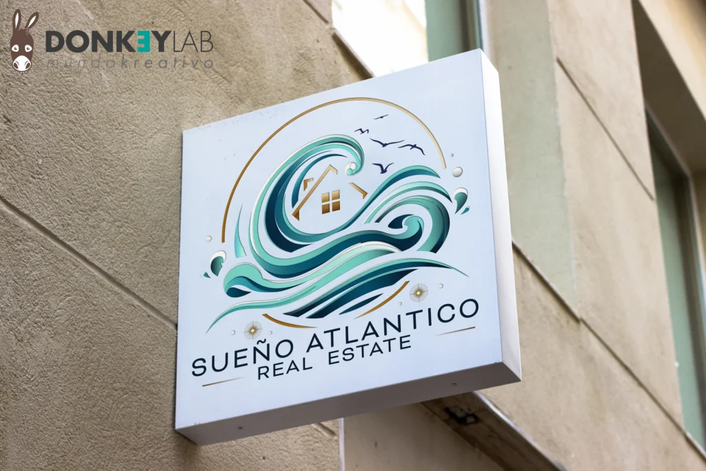
On the Spanish real-estate market, dozens of agencies compete for the same buyers, many of whom search for a home from far away. The logo is often the first thing they see: on a listings portal, on a sign, in a WhatsApp profile picture. For Sueño Atlántico, an agency that handles high-end properties, we designed a real estate agency logo that had to say one thing clearly: quality properties, close to the sea. Here is how we got there.
In this article
Why a real estate agency logo matters so much
Buying a home is a big, emotional decision, and it is only entrusted to someone who inspires trust. A professional logo is the first signal of that trust and appears everywhere the agency shows up:
- listings portals and the agency’s website;
- shop windows and office signs;
- “for sale” signs in front of properties;
- brochures, business cards and email signatures;
- social profiles and video watermarks.
A weak or generic logo makes the agency look small or temporary; a strong one makes it look solid, even when it is new.
The brief: exclusive, refined, linked to the sea
Sueño Atlántico works with quality properties. The name itself, “Atlantic Dream”, evokes the ocean, the light and the idea of a dream home by the sea. The logo had to convey that feeling while staying sober and professional, suited to someone who handles important transactions.
Before drawing anything we studied the agency’s market: who the buyers are, where they come from and how competitors present themselves. Understanding the market and the territory was the real starting point of the project.
Our process for a real estate agency logo
1. Research and positioning
We analyzed the offer of the agency and its competitors to find a visual space not yet taken. In a crowded market, being different is half the job.
2. Hand sketches
Ideas are born on paper. Sketches are fast and let us explore shapes, symbols and lettering without constraints before choosing a direction.
3. Vector drawing in Adobe Illustrator
The chosen sketch was rebuilt as a vector logo in Adobe Illustrator. Vector files scale to any size without losing quality, from a favicon to a large sign.
4. Right the first time
A logo usually goes through several rounds of changes before approval. In this case the first proposal already expressed what the client wanted to say and moved forward with small tweaks. It is the result of good preparation: when the brief and the research are clear, the design follows.
5. The applications
A logo only works if it works everywhere. We checked it in colour and in one colour, on light and dark backgrounds, small and large, so the agency can use it on signs, print and digital without surprises.
Originality first
The fastest way to look like everyone else is to copy what is fashionable. Many logos in the sector use the same roofs, the same keys and the same house silhouettes: they are understood instantly but barely remembered. We always aim for an original mark that belongs to a single brand, especially in a competitive market like real estate.
What makes a real estate agency logo effective
- Legible when small. On portals and phones the logo is often tiny.
- Works on photos. It will sit on top of property images and videos, so you need a version that stays visible.
- Right for the market. A luxury agency and a budget rentals agency shouldn’t look alike.
- Memorable. Buyers see many agencies: the logo has to be easy to remember when they are ready to call.
What you receive at the end of a logo project
A logo is only useful if it arrives with the right files. At the end of the project you should receive:
- vector files (AI, EPS, SVG or PDF) for print, signs and large formats;
- image files (PNG with transparent background and JPG) for web, documents and social media;
- full-colour and one-colour versions, plus a white version for dark backgrounds;
- horizontal and vertical versions, if the logo has to fit different spaces;
- colour codes in CMYK, RGB and HEX and the names of the typefaces used.
With these files any printer, developer or sign maker can use the logo correctly, without asking the designer every time.
More than a logo
The logo is the beginning of a brand, not the end. For real-estate agencies we also design letterhead, signs, brochures and websites, and we produce the content that sells properties: photography, drone footage and 360° virtual tours. When everything follows the same identity, the agency looks consistent and professional at every touchpoint. See more work in the portfolio.
Frequently asked questions about the real estate agency logo
How long does it take to design a logo?
It depends on the project and how quickly feedback comes in, but a clear brief and good initial research shorten the path a lot.
Which files do I receive?
Vector files for print and signage, plus image files for web and social media, in full-colour and one-colour versions.
Do you only design logos for real-estate agencies?
No. Real estate is one of our main sectors, but we design identities for businesses of every kind in Spain, Switzerland and Italy.
Can you redo the logo I already have?
Yes. A restyle keeps what people already recognize and fixes what no longer works.
Need a logo that sells?
Tell us about your business: we’ll reply with a clear idea and a fixed-price quote. To see more identity work, take a look at the portfolio.