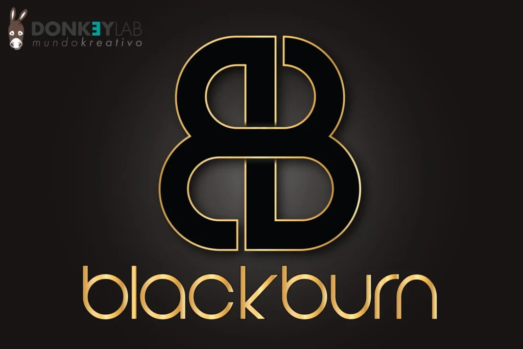
The company logo is the heart of the visual identity: the one element that appears on everything and the one people remember. For Blackburn, a company based in Switzerland, we designed the company logo and then built the complete identity around it, from the first sketch to the print material, the website and the branded planners.
In this article
Designing for a Swiss company
Switzerland has a strong design culture: clean, precise, reliable. Swiss clients expect an elegant, well-made logo with no pointless decoration. At the same time, Blackburn wanted its brand to convey exclusivity and strength. The project had to balance both.
The concept: gold on a dark background
We chose a golden logo on a dark background. Gold conveys value and exclusivity, the dark background gives weight and solidity. The contrast also makes the logo easy to read at any size, from a business card to a sign.
The style is deliberately sober. A strong company logo doesn’t need many elements: it needs the right ones.
A shared process
A logo isn’t drawn in isolation. We worked closely with the client to understand:
- the company’s history and where it wants to go;
- its values and personality;
- its audience and how it chooses;
- its market and competitors.
These answers guided every choice, from the shape of the symbol to the typeface.
From sketch to final company logo
1. Sketches and drafts
We explored several directions with sketches and first drafts, presenting the strongest options to the client.
2. Refinement
The chosen direction was refined in the details: proportions, spacing and the relationship between symbol and lettering.
3. The versions
We prepared the company logo in full colour, one colour and reversed, so it works on any background and with any printing method.
Beyond the logo: a complete identity
Once the logo was approved we applied it to every element the company uses:
- letterhead for letters, quotes and contracts;
- business cards;
- envelopes;
- graphic design of the website;
- branded planners and calendars.
Every piece follows the same colours, typography and rules, so the company looks consistent whether a client receives a letter or visits the website.
Consistency builds a strong brand
The value of an identity grows with every contact. When the logo, colours and tone are always the same, people recognize the brand without reading the name: that is what makes a company memorable and trustworthy.
Common mistakes we help you avoid
- Too many details. Thin lines and small elements disappear when the logo is printed small or embroidered.
- Chasing trends. A logo based on this year’s trend looks old in two years.
- Only one version. Without a one-colour and a reversed version, the logo doesn’t work on dark backgrounds, stamps and photocopies.
- Unreadable typefaces. A decorative typeface can look elegant on screen and become illegible on a sign seen from the street.
- No rules. Without simple guidance on colours and spacing, every supplier uses the logo in their own way.
A good company logo is tested before it is delivered: small and large, in colour and in black and white, on paper and on screen. That’s the difference between a nice drawing and a logo that works for years.
What makes a logo last
The best logos are simple, distinctive and right for the business. Simple, to be recognized in a fraction of a second. Distinctive, so they aren’t confused with competitors. Right, to say the correct thing about the company. Blackburn’s golden mark on a dark background was designed with these three criteria, to serve the company for many years without the need for a restyle. Want to understand the difference between a brand and a logo? We also talk about it in the free consultation.
The company logo the Donkey Lab way
We have designed identities for clients in Switzerland, Italy and Spain, from small businesses to real-estate agencies and industrial companies. Logo and identity are part of our services, together with websites, print and visual content. For comparison, go to the portfolio page.
Frequently asked questions about the company logo
Do you work with clients in Switzerland?
Yes. We have worked for many years with Swiss clients, remotely, by phone, email and video call.
How many logo proposals do I receive?
We present the strongest directions that emerged from the research, then refine the one you choose.
What do I receive at the end?
The company logo in all versions and formats, plus the print material and applications included in the project.
Can you also design the website?
Yes. We build websites that follow the same identity as the rest of the brand.
Need a logo for your business?
Tell us what you do: we’ll reply with a written quote. To see more identity projects, take a look at the portfolio.