A logo on its own is not a brand. A brand is the impression people get every time they come across your business: on a business card, in an email, on the website, on an invoice. A corporate identity is the work that makes all those moments look and feel like one company. We tell you how we approached it for our own studio, Donkey Lab, and what every business should consider.
In this article
What a corporate identity includes
A corporate identity is the system of visual rules a company uses everywhere:
- the logo and its variants;
- the colour palette;
- the typography;
- the style of images and graphics;
- the way these elements combine in every document.
When these rules are clear and applied consistently, people recognize the company at a glance, even before reading its name.
Letterhead and print: the everyday face of the brand
Print is where a corporate identity is used most often, and where inconsistency shows first.
Letterhead
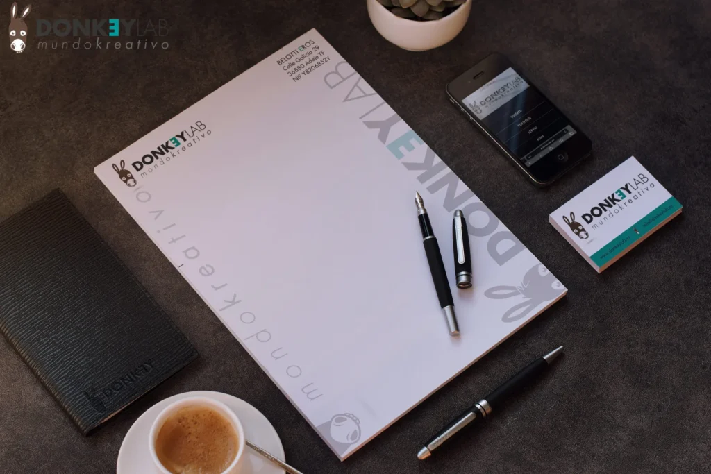
Every letter, quote and contract carries the letterhead. It should have the logo and company details in a clean layout that leaves room for the content.
Business cards
The business card is often the first physical contact with a client. The paper, the printing and the layout say something about the company.
Envelopes
A detail that is often forgotten. The envelope is the first thing the client sees when receiving your documents and should belong to the same family as what’s inside.
The website: the brand’s shop window to the world
Today most people meet a business online first. The website should follow the same identity as the print, with the same colours, typefaces and tone. It also has to work: be fast, easy to navigate and optimized for search engines, so that people actually find it.
Planners and calendars
Branded planners and calendars keep the identity present every day, on the desks of your team and your clients. They are practical objects kept for a whole year, which makes them among the most effective giveaways.
Why consistency matters
Every time someone sees your brand, the impression adds up. If the logo is different on the website and on the business card, or the colours change from one document to the next, the impressions don’t add up: they cancel out. Consistency turns many small touchpoints into a strong, recognizable brand.
How we build a corporate identity
1. Understanding the business
We start from who the company is, who its customers are and how it wants to be perceived.
2. Logo and visual system
We design or refine the logo and define colours, typography and graphic style.
3. Applications
We apply the system to print, website, signs, social media and any other material the company uses.
4. Delivery
We deliver all the files, ready for print and online use, with simple rules on how to use them.
Our own identity
For a design studio, its own identity is also its calling card. The Donkey Lab corporate identity, with the donkey symbol and the aqua-green colour, is used consistently across print, website, clothing and social media. It’s the same approach we bring to our clients.
See how we apply it for clients in the portfolio and find out what else we do on the services page.
Signs that your identity needs attention
- Your logo is different on the website, the van and the business cards.
- Every new document is designed from scratch, in a different style.
- The logo file you have is a low-quality image that turns grainy when enlarged.
- Clients mistake you for a competitor.
- The brand no longer reflects what the company has become.
If you recognize yourself in any of these, reviewing the corporate identity is usually quicker and cheaper than you’d think, and it pays off every day in the way clients perceive the company.
Keeping a brand consistent over time
Designing an identity is the first step; using it consistently is what makes it work. Over the years small inconsistencies creep in: a stretched logo on a flyer, a slightly different colour on a sign, a new typeface on social media. Together they weaken the brand. A few simple tools prevent this:
- a short brand guide with rules for the logo, colours and typefaces;
- ready-made templates for documents, presentations and social posts;
- a shared folder with the official logo files, so nobody uses an old version;
- one person responsible for checking new materials before they are published.
We apply the same discipline to our own brand and to the identities we design for clients.
Frequently asked questions about corporate identity
What’s the difference between a logo and a corporate identity?
The logo is a single element. The corporate identity is the whole system of logo, colours, typography and rules applied to everything the company uses.
Does a small business need a corporate identity?
Yes. A consistent identity makes a small business look solid and reliable, often more than its size would suggest.
Can you update an existing identity?
Yes. We can refresh an identity while keeping the elements customers already recognize.
Do you also handle printing?
We deliver print-ready files and can coordinate production for you.
Want a brand people remember?
Tell us about your business: we’ll reply with a written quote and a clear idea of where to start.